
Most brand projects begin with a request for a logo, but a well-drawn mark cannot keep a company from looking improvised across its applications.
Brand identity design defines how a brand behaves wherever it appears. Recognition comes from the consistency of typography, color, spacing, imagery, and tone not from the logo alone. A durable identity is built in order: strategy first, then the core visual system, applications, and the rules that protect them.
A Logo Is Not a Brand Identity
A logo is a signature, not a complete identity. It can confirm authorship, but it cannot explain what a company values, how it speaks, or why people should trust it.
That work belongs to the broader system: typography, color, spacing, imagery, and application rules. Brand identity design often fails beyond the first presentation, when a convincing mark must also work across pitch decks, invoices, websites, and app icons.
Brand Strategy Decides What the Design Must Carry
Design cannot resolve questions the business has not answered. Before visual work begins, brand strategy should define the audience, competitive position, and belief the brand needs to create.
These decisions turn an open aesthetic problem into a focused design brief. A brand competing on craft needs different evidence from one competing on speed. Before design starts, clarify:
- who the brand competes with for attention
- what customers should believe after a first impression
- which constraints shape the identity, including budget, formats, team, and pace
Without that clarity, brand identity design becomes a matter of taste rather than strategy.
Research Should Find Meaningful Difference
Research is more than collecting admired references. A moodboard records preference, but it does not explain why a visual language works within its category.
Useful research identifies which conventions carry meaning and which are simply habit. The goal is to find a small number of distinctive choicessuch as a disciplined color, an unexpected type weight, or a consistent image cropthat can work across websites, packaging, presentations, and social content.
A simple test is whether an element would be missed if removed. If it appears once, it is decoration; if it structures multiple applications, it belongs to the identity system.
A Visual Identity System Needs a Core and a Range
A visual identity system has two layers. The core holds the elements that never change: the mark and its clear space, the primary typeface, the primary colors, and the underlying grid. The range holds the elements that flex: secondary palettes, illustration, motion, and layout variants for different formats.
Brands that define only the core produce work that is consistent and lifeless. Brands that define only the range produce work that never accumulates into recognition. Effective brand identity design fixes the core tightly and gives the range enough room to handle a campaign, a product launch, and a recruitment post without breaking.
Aalix Studio’s brand identity and visual systems practice treats the core and the range as one deliverable, because a system defined without its extensions is usually redefined within a year.


Typography Carries More Weight Than the Mark
Most brand communication is typographic. Customers may see the logo only a few times, but they read headlines, body copy, captions, and interface text throughout the experience.
A functional type system defines the hierarchy, weights, scale, and line height for each role. When these rules are clear, work created by different teams can still remain recognizable and consistent with the brand.
Color Should Be Structured, Not Collected
A useful color palette assigns each color a role. One color may lead the identity, supporting colors add flexibility, neutrals handle text and surfaces, and functional colors communicate states such as errors or confirmations.
Defining these roles early also improves accessibility. Contrast, text legibility, and interface states should be tested while the visual identity system is being built, not left until development.
The Identity Must Survive Its Smallest Application
A brand identity must remain recognizable at its smallest scale. Favicons, app icons, email signatures, and labels often remove detail, color, or both.
Test the mark early at sixteen pixels, in one color, and over photography. These simple checks reveal whether the identity depends on details that will disappear in everyday use.
Brand Identity Design for Two Kinds of Credibility
AlphaE is a Texas medical coordination platform that connects personal injury attorneys with medical providers who accept Letters of Protection. The brief asked for a logo that felt credible. The difficulty was that credibility means two different things to the two audiences it serves.
Attorneys read credibility as institutional and precise. Providers and injured clients read it as calm and reassuring. Legal and healthcare conventions pull in opposite directions, and a mark committed fully to either would have alienated half the platform's users.
The solution came through construction rather than styling. A geometric, tightly spaced mark and restrained palette allow the identity to feel institutional in legal contexts and clinical in healthcare settings. The AlphaE logo and brand identity case study shows how this logic extends to case-facing communication and marketing collateral.
The principle transfers. When a brand serves two audiences with conflicting expectations, the resolution usually lives in the structure of the system rather than in the decoration applied to it.
Brand Guidelines Protect the System
Brand guidelines should preserve decisions, not simply document that a project was completed. They need to define logo usage, minimum sizes, typography, color roles, image direction, layout principles, and tone of voice, while explaining the reason behind each rule.
Clear guidelines allow internal teams, freelancers, and agencies to extend the visual identity system without weakening it. Before approval, check:
- whether the mark remains clear at sixteen pixels and in one color
- whether work created only from the guidelines still feels recognizable
- whether every rule can be explained in one sentence
Consistency does not mean repeating the same layout everywhere. A strong identity repeats its logictype relationships, color roles, and image treatmentwhile allowing the content and format to change.
The Brand Identity Process Has an Order That Matters
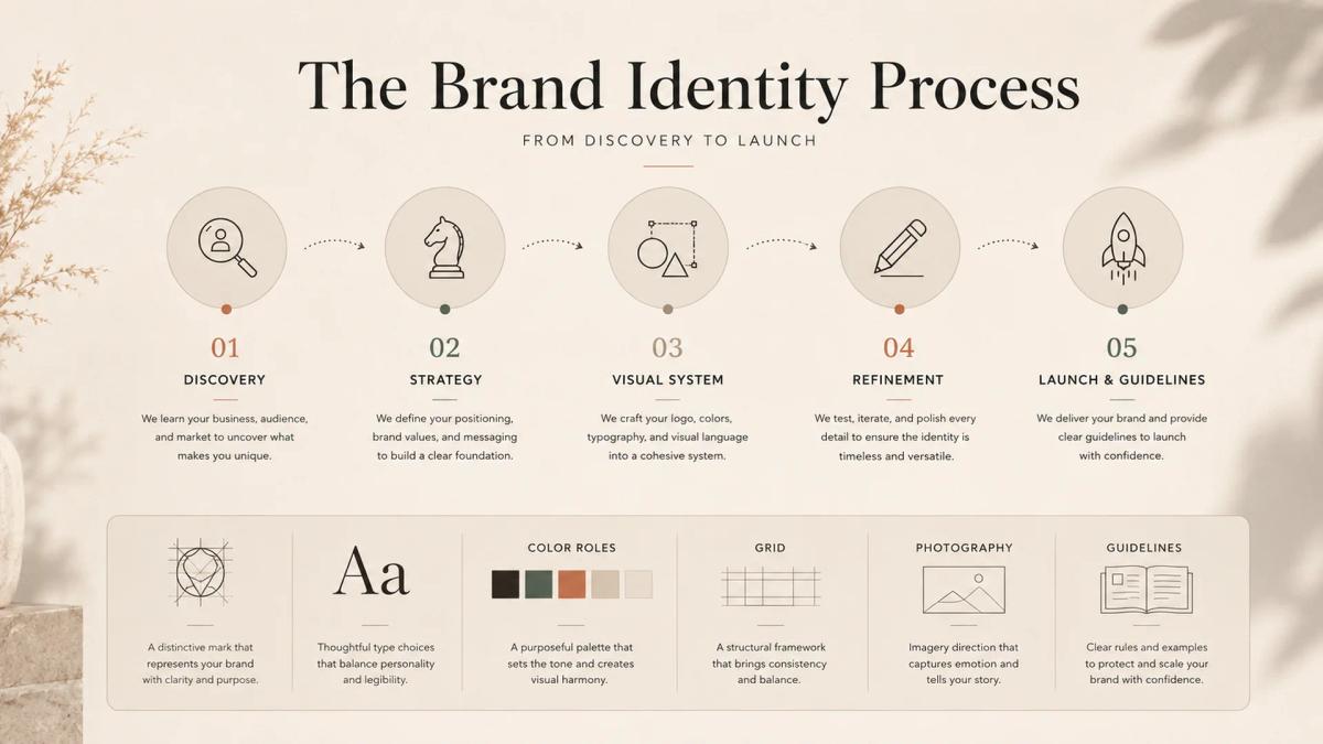
The brand identity process runs through discovery, strategy, design, refinement, and launch. The order is not administrative. Each stage removes options, and removing options is what makes the following stage possible.
Work done out of sequence tends to be redone. A palette chosen before positioning is agreed upon must be defended on taste alone, while a logo approved before the type system exists may need to be redrawn beside real headlines.
Refinement is the stage most often compressed. It is where the identity meets real copy, image ratios, and formats, and where the distance between a presentation board and a working system becomes visible.

Digital Touchpoints Test the System First
For most brands, the website is where the identity is used hardest and judged fastest. It carries more type, more states, and more edge cases than any printed piece.
An identity developed without interface conditions in mind tends to fail there. Buttons, forms, error states, and small type all require decisions a logo presentation never covers. Brand identity design that stops at the mark leaves them to whoever builds the site.
The same gap appears in Aalix Studio’s article on luxury fashion website design, where a campaign page and a checkout screen that feel unrelated undo the sense of quality. An identity is only as consistent as its least considered screen.
An Identity System Should Be Designed to Age
Brands change. Products are added, audiences shift, and a company that launched with one offer ends up with four. An identity built tightly around a single product cannot absorb that.
Designing for age means leaving defined room: a naming structure that can take a sub-brand, a palette with space for one more accent, a type system with a weight held in reserve. These are decisions made while the system is built, not concessions made later under pressure.
What Holds a Brand Identity Together
Brand identity design produces recognition, and recognition comes from repeating a logic rather than from the quality of any single mark. A system decided in the right order and written down will outperform a more beautiful identity that was never defined past the logo.
The trade-off is honest. Building a system takes longer than designing a mark, it forces decisions a business may not be ready to make, and it asks a team to hold a line long after the work stops feeling new. A brand unwilling to maintain a system is better served by something simpler than by rules it will ignore.
Brands planning an identity from scratch can start a project with Aalix Studio, where strategy, the visual identity system, and the guidelines are developed as one piece of work.
Brand Identity Design FAQ
What makes a brand identity memorable?
A memorable brand identity relies on a few distinctive choices applied consistently. Defined colors, typography, and image treatment build recognition more effectively than visual complexity.
Is a logo enough for a small brand?
No. Even a small brand needs basic rules for typography, color, spacing, and imagery. A logo identifies the business, but the wider visual identity system keeps its communications consistent.
Why is brand strategy important before design?
Brand strategy defines the audience, competitive position, and perception the brand needs to create. It gives design decisions a clear purpose and prevents them from being judged only by personal preference.
How long does the brand identity process take?
The brand identity process commonly takes four to ten weeks, depending on research depth, stakeholder involvement, and the number of applications required. Compressing discovery and strategy often creates more revisions later.
What should brand guidelines include?
Brand guidelines should cover logo usage, typography, color roles, layout principles, image direction, tone of voice, and incorrect applications. They should also explain the reasoning behind key rules.
What is included in a visual identity system?
A visual identity system typically includes logos, typography, color, grids, imagery, iconography, illustration, motion, and rules for adapting the identity across digital and physical applications.