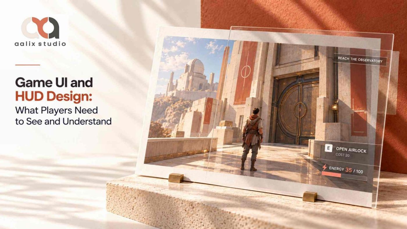
Imagine a player retreating during a fight. Their weapon is nearly empty, and just as they decide whether to fire or reload, a mission update slides over the ammunition counter.
The number itself was correct. The problem was that the player could not use it when it mattered.
Good game UI and HUD design is not only about displaying information. It is about making the right information available at the moment a player needs to understand a situation, make a decision, or confirm what happened after an input.
That means judging the interface during play, not only in clean screenshots, and testing whether it remains readable as the scene, controls, priorities, and player state change.
Start With a Decision, Then Choose the Display
The user interface includes menus, inventory, maps, settings, and other controls or information displays. The heads-up display, or HUD, presents information during gameplay. A video game user interface should give each decision an appropriate place: immediate choices need accessible information, while detailed comparisons can live in a view players deliberately open.
Decide What Must Remain Available
Start with the player's choice. "Cross the exposed courtyard or wait" requires protection and route information. Comparing weapons requires comparable statistics and enough time to inspect them. Those decisions call for different displays.
Health deserves a persistent position when damage frequently affects decisions. Navigation may need emphasis at a junction, while resource totals can stay in inventory unless they govern an immediate action. Interaction prompts should identify available actions and clear when the opportunity ends. Objective details can move to a journal, with only a concise reminder kept in play.
Agree Where the World and Interface Share the Job
Interface priorities also depend on the surrounding art. Aalix Studio's Game Art & 3D Assets capabilities connect UI and HUD with environment art and art direction. A distinctive exit may communicate a route through silhouette, while a counter supplies an exact quantity. Decide where each answer belongs before adding interface markers to compensate for an unresolved scene.
Separate Persistent Status From Interruptions
A shield meter shows remaining protection without demanding constant attention. A brief signal when the shield breaks can announce the change, then settle into a readable depleted state. In game HUD design, this separates a value players consult from an event they need to notice.
Give Competing Messages an Explicit Order
Return to the retreating player. Suppose low ammunition, a new objective, and a collectible notification arrive together. Ammunition affects the next action; the objective matters after reaching safety; the collectible can wait. For that encounter, the interface could follow three practical rules:
- Protect the ammunition counter from overlapping notifications while the weapon is active, including during aiming and reloading.
- Show the urgent resource change briefly beside the counter, while deferring the expanded objective message until combat ends.
- Queue collectible confirmations, combine repeated pickups where appropriate, and keep a recoverable record in inventory.
That priority is contextual, not permanent. In an escort mission, a warning about the companion may outrank ammunition. Alert priority should follow the action required now.
Stable positions help players find routinely checked values. Temporary alerts need space that does not obscure aiming or important world cues. Motion can emphasize a change, but repeated animation competes for attention. Alerts also need an end condition so resolved or obsolete messages do not remain on screen.

Keep the Hierarchy Readable in Motion
The background changes what players can read. Test game HUD design against bright skies, dark interiors, particles, camera movement, and visually dense scenes. An outline or adjustable background panel may separate text from the scene; simply enlarging a label will not fix overlap with another element.
Desktop and television viewing deserve separate checks because reading distance changes. Text size and HUD scale controls should still work with longer labels and enlarged layouts. Pair color with a label, shape, or pattern, and let players reduce optional pulsing while keeping a clear warning state.
Navigation cues also need review from the player's viewpoint. The discussion of environment concept art shows how landmarks and visual direction can support that task. A clearly visible doorway may need no extra marker; an ambiguous route should be examined through the scene and interface together.
Explain What Happened After the Input
A prompt shows that an action is available, but pressing its button does not prove the action succeeded. Reviewing game UI and HUD design as isolated screens misses the transitions that explain whether input was accepted, rejected, interrupted, or completed.
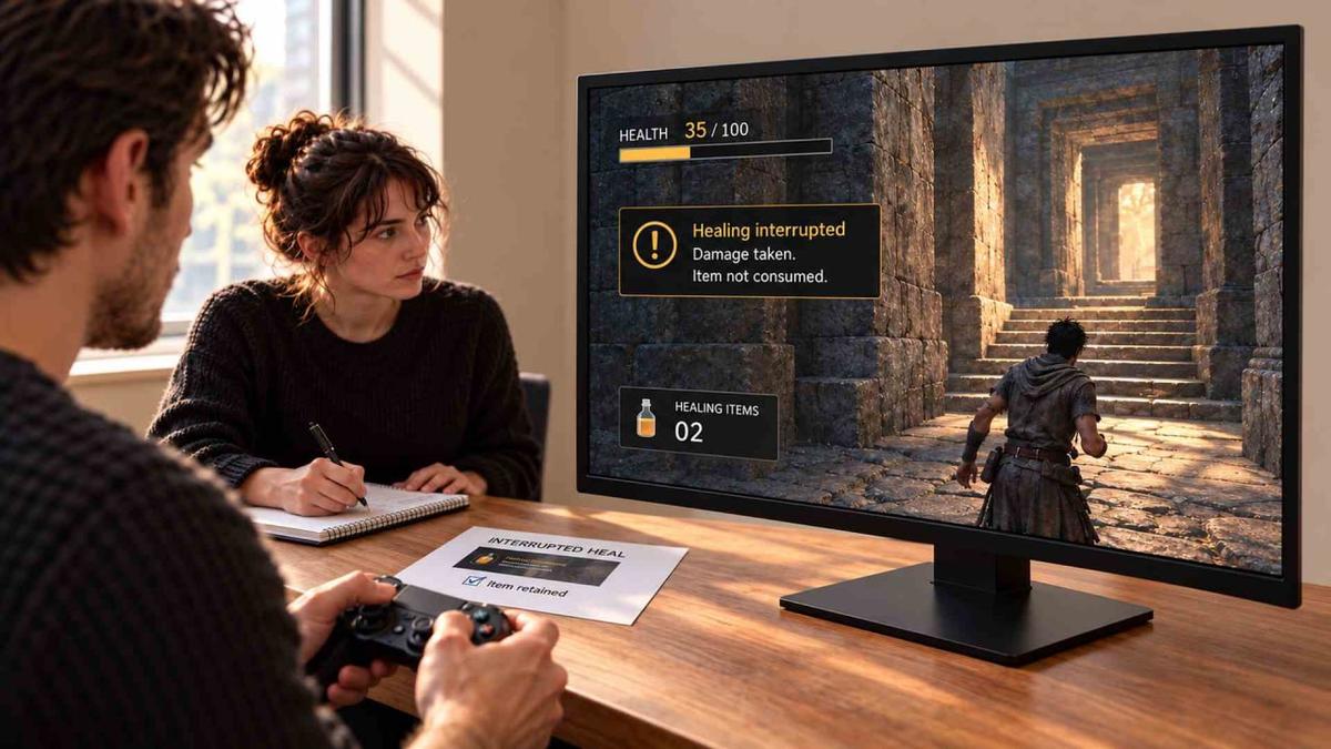
Consider a healing action. Progress confirms that healing began; a changed health value confirms completion. If the item is unavailable, the interface should explain the rejection. If damage interrupts healing, feedback should identify the interruption and whether the item was consumed. A generic flash leaves the player unsure whether to retry or choose another action.
Sound and vibration can reinforce those events, but players may disable them or use devices without haptics. Essential audio information needs an accessible alternative, and essential visual information may need a meaningful sound or spoken status. Additional channels should communicate the same event rather than add effects whose meaning has to be guessed.
A video game user interface should also preserve feedback when optional effects are reduced. Disabling a healing animation should not remove the confirmation or interruption state that explains the mechanic.
Choose World Integration by Its Viewing Conditions
Diegetic UI presents information through something that exists within the fiction and is perceptible to the relevant character, such as a vehicle instrument or wrist display. A marker floating above an object is not automatically diegetic simply because it occupies world space.
A wrist display may suit deliberate inspection during exploration and reinforce the fiction. In combat, camera turns, occlusion, changing light, or movement can make it difficult to read. Choosing diegetic UI therefore requires asking whether inspecting it supports the intended decision or adds avoidable difficulty. Removing a HUD does not automatically create greater immersion.
A hybrid approach can keep the in-world instrument while repeating a critical warning in a stable screen position. Both presentations need synchronized states; conflicting values undermine trust. Duplication is justified when it improves access, but it should still be reviewed for clutter.
Keep Menus and Input Methods Consistent
Inventory supports comparison, maps support route planning, and settings let players adjust presentation. Consistent names and symbols connect these views to gameplay. A resource called "energy" on the HUD should not become "charge" in inventory without explanation. Game interface design needs shared conventions as well as a clear layout within each view.
Controller focus, mouse hover, selection, and activation are different states. Highlighting an item should not imply that it has been equipped. When input changes, prompts should follow the active method while navigation remains usable. If an item disappears, focus needs a defined destination.
Settings previews can expose game interface design problems before players resume. Show representative gameplay content and a longer label; a scale slider alone cannot reveal overlap in the resulting layout.
Diagnose Failures and Hand Over Tested Behavior
Find Which Part of the Decision Failed
Test game UI and HUD design before final polish in situations with low health, depleted resources, simultaneous alerts, and changed input. Observe before explaining. Missing an ammunition warning suggests a visibility problem; noticing but misreading it suggests a wording or symbol problem. Understanding it but failing to reload calls for checking the control, timing, or gameplay restriction.
Treat those observations as hypotheses. Replay the situation with a competing alert removed, for example, to test whether it concealed the warning. Change the suspected cause and repeat the check with relevant players, including people with accessibility needs. A few successful attempts can support a specific revision, but they cannot prove the entire interface works for everyone.

Specify One Element Beyond Its Artwork
A production handoff should describe behavior, not only appearance. For a low-ammunition warning, define when it starts, when it clears, what happens after a weapon switch, whether its animation repeats, and how loaded rounds differ from reserve ammunition. Show the approved states with controller and keyboard prompts, scaling limits, and longer translated strings.
Animation duration, reduced-motion behavior, and state changes also need agreed examples. Graphic files alone cannot define these rules. A clear game art brief should connect deliverables with acceptance criteria and assign responsibility for resolving contradictory rules before implementation.
Final Thoughts
Choose one gameplay situation where missing information could change the outcome. Review game UI and HUD design through the player's decision, then reproduce any failure before approving the display.
An unreadable counter or contradictory prompt should block approval for that situation; decorative refinement can wait. If diegetic UI carries critical information, include obstructed and difficult viewing conditions in the test. Keep the observed problem and tested repair together so later visual changes can be checked against the same requirement.
Game UI and HUD Design Frequently Asked Questions
What is the difference between UI and HUD?
UI includes menus, inventory, maps, settings, and other interface views. The HUD is the part of the interface that presents information during gameplay.
Which information should stay visible?
Keep information visible when it affects immediate decisions. Less urgent notifications can be deferred, as long as critical status remains easy to find and delayed information is still recoverable.
Does diegetic UI always improve immersion?
No. Information placed inside the game world can become difficult to read because of movement, lighting, camera angle, or obstruction. A hybrid approach may be more reliable when the information is critical.
How should teams evaluate an interface?
Observe players during situations such as low health, depleted resources, competing alerts, and input changes. Distinguish missed information from misunderstanding or difficulty acting, then revise the suspected cause and retest the same situation.